The task: a unique visual system that blends together classic Nike branding and Conscious Minds’ “human-centered” design.
The visual system would primarily live as an elaborate Keynote deck template, to be used in all visual communications between Conscious Minds and the Nike clients. Specifically, it had to:
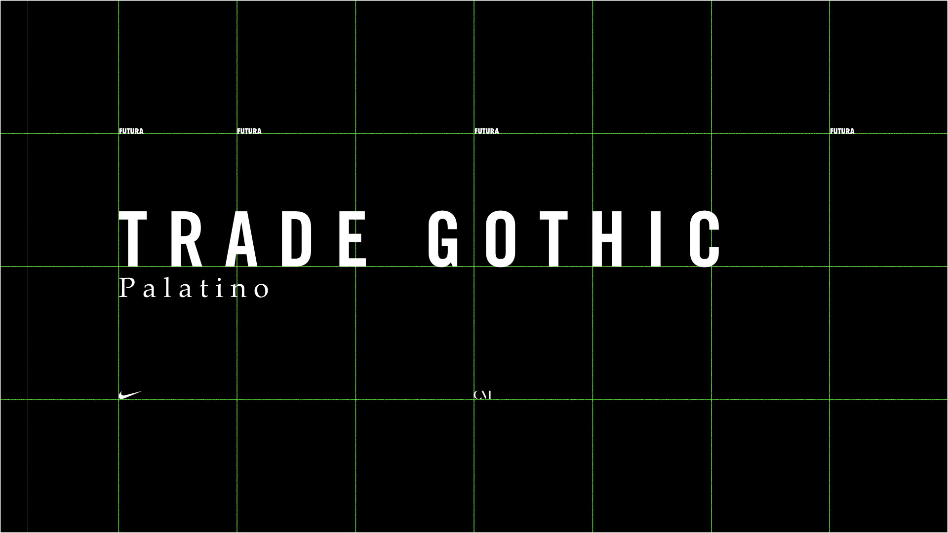
- Only use approved Nike colors. (black and white with either Volt Green or Nike Orange)
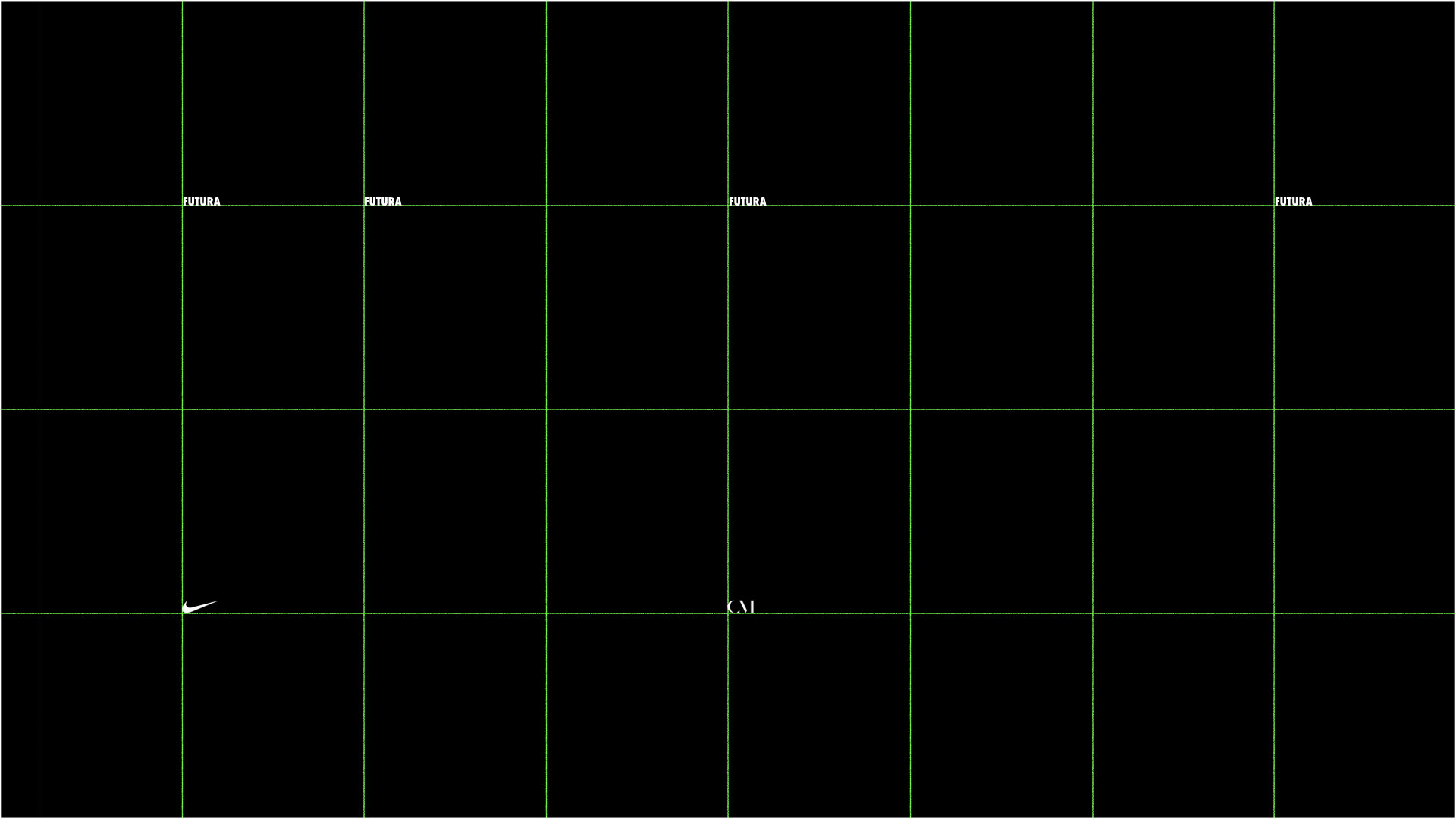
- Contain all of Nike’s signature fonts. (Palatino, Futura Extra Bold, Trade Gothic Bold Condensed, and Trade Gothic for Nike 365.)
- Most importantly, the system had to be easy to understand and use, so that everyone at Conscious Minds could use it—not just the designers.
Client: Nike
Agency: Conscious Minds
Role: Designer

The Process:
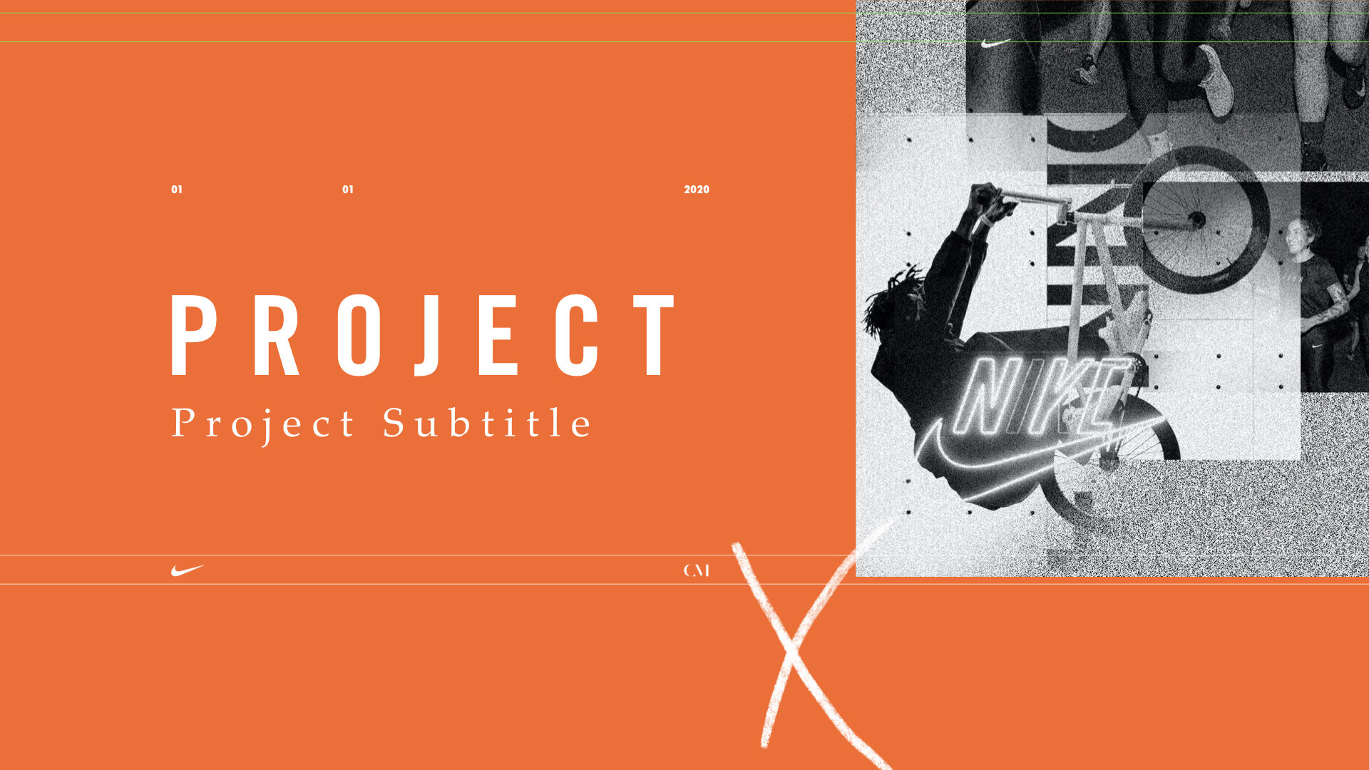
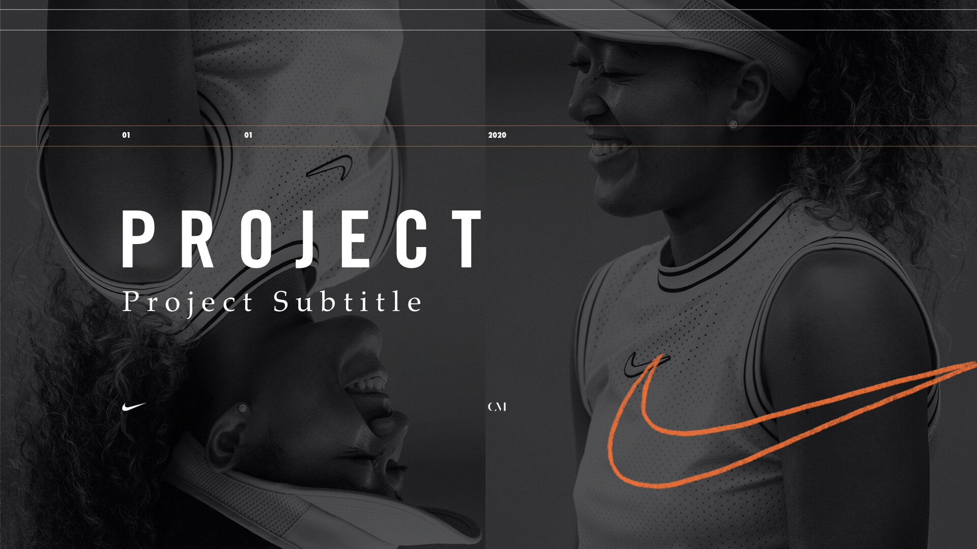
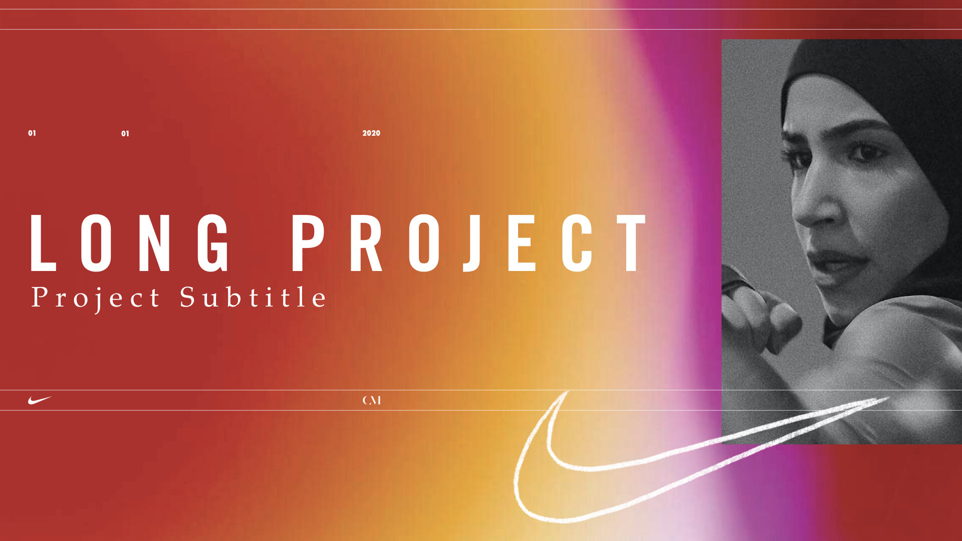
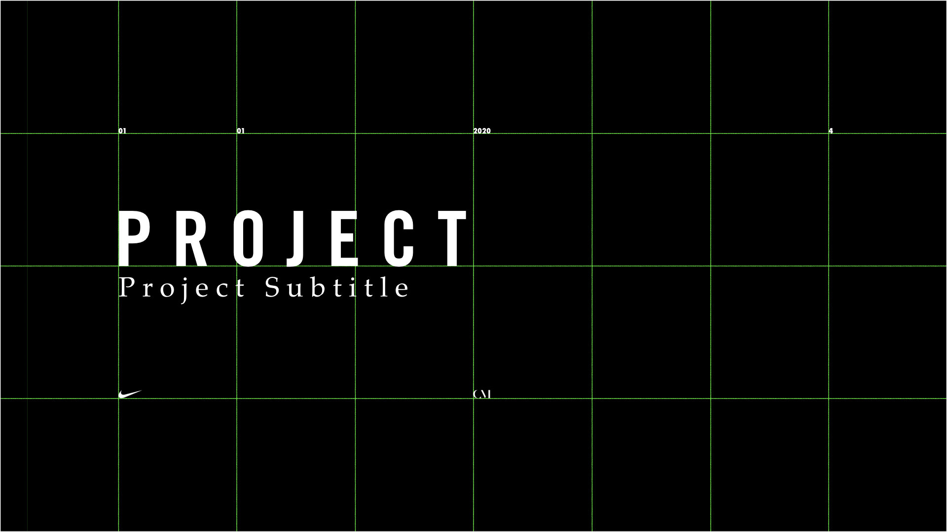
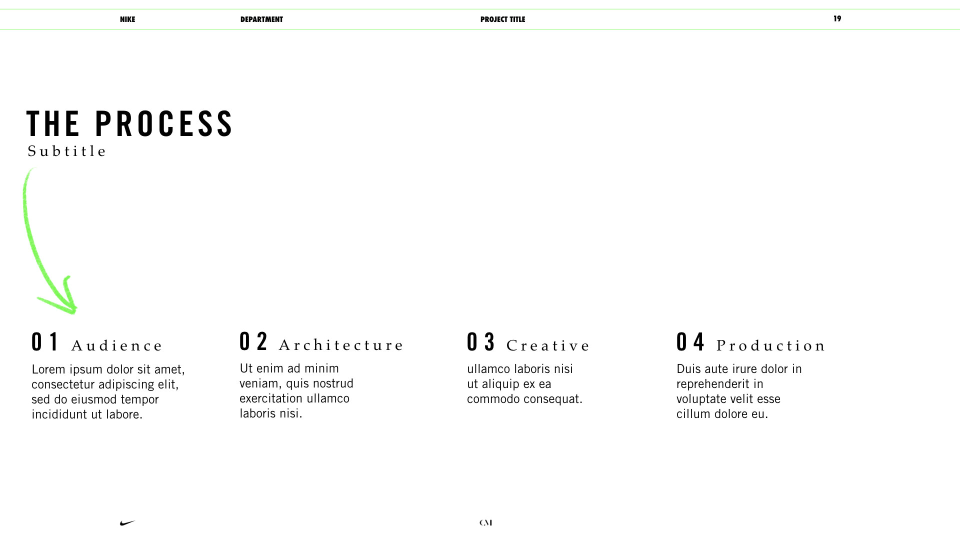
I started by building a versatile grid and designing the title page. I had to include all of Nike’s fonts, but I didn’t necessarily have to use them in a traditional manner.

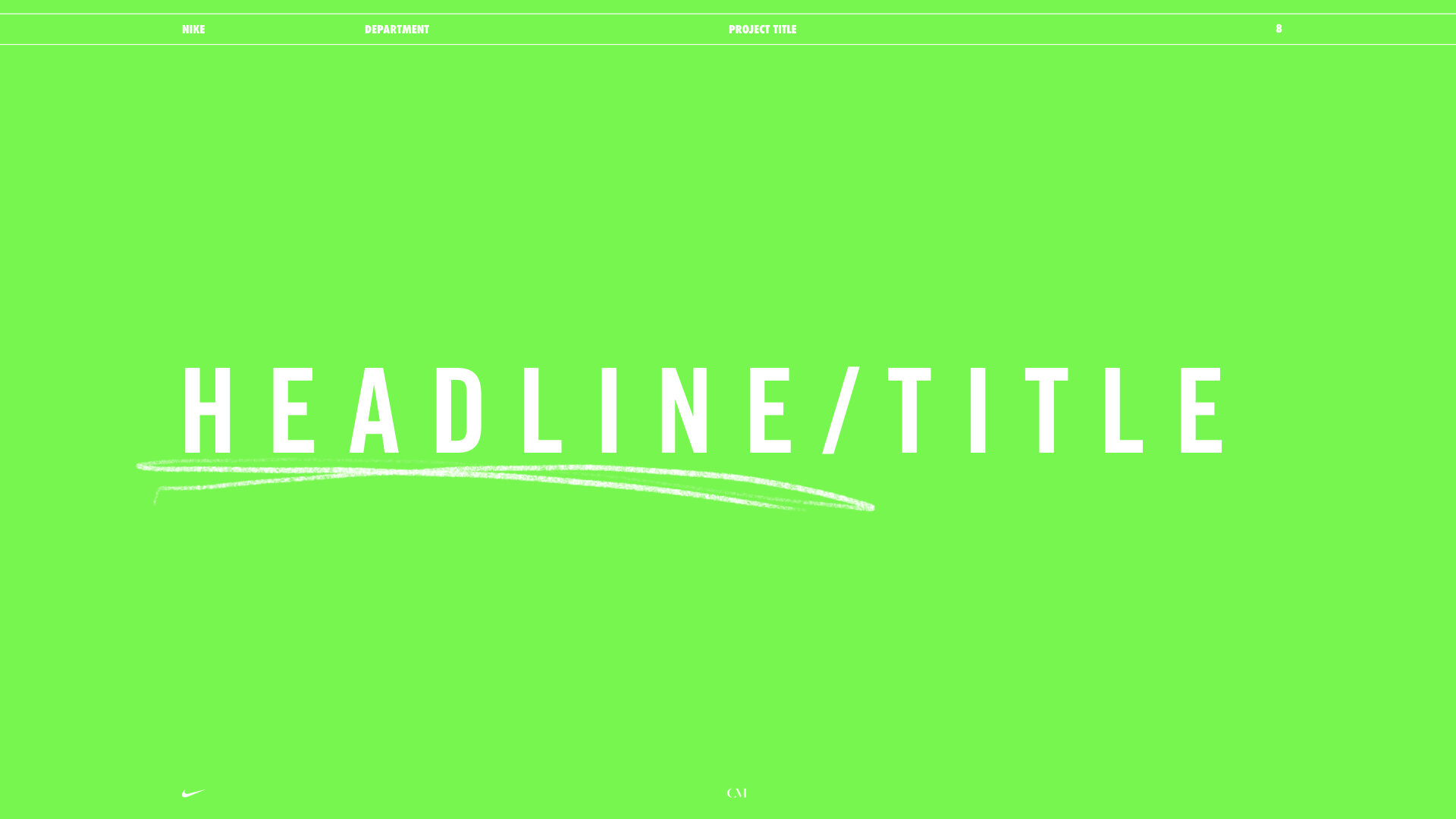
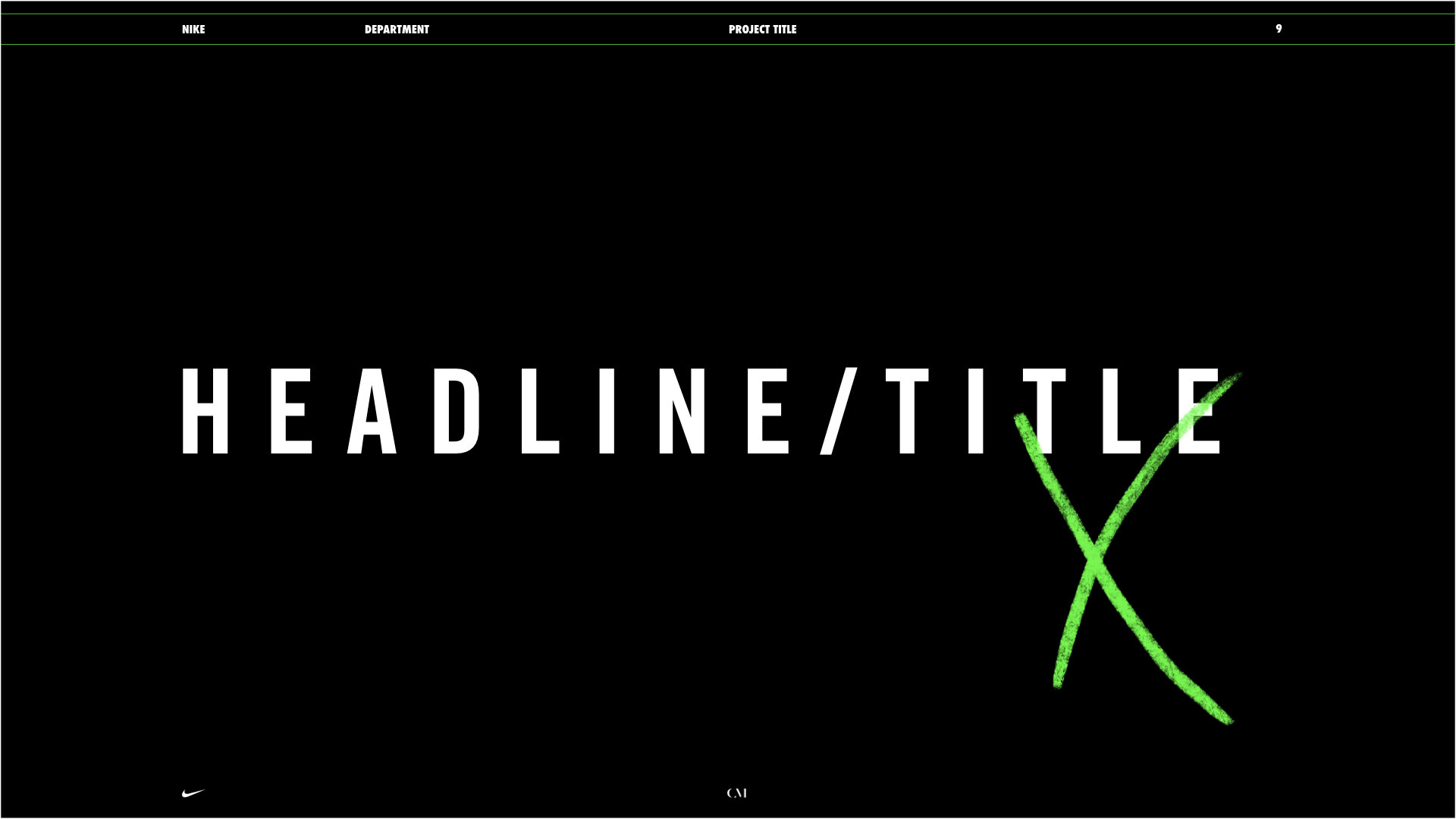
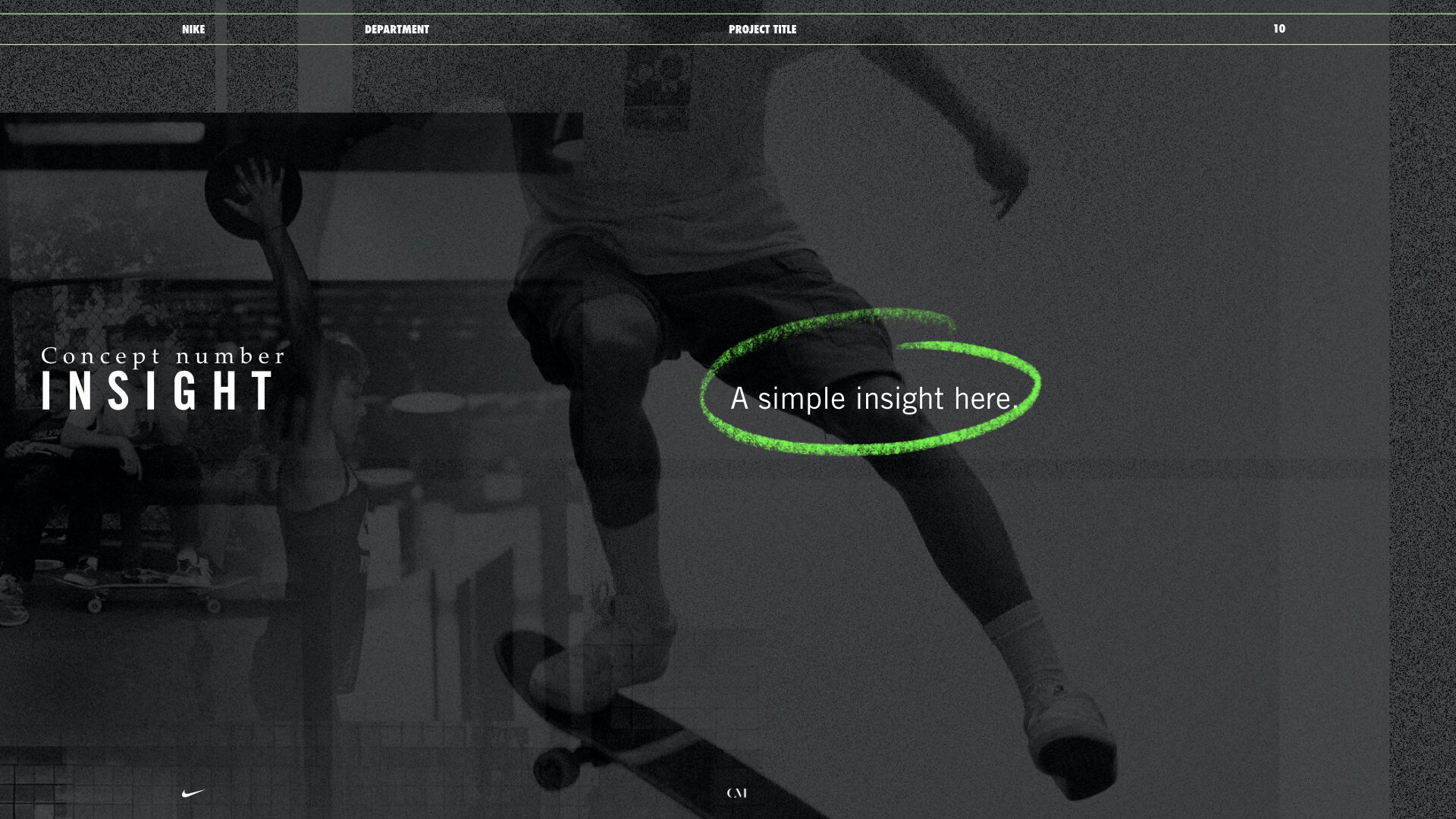
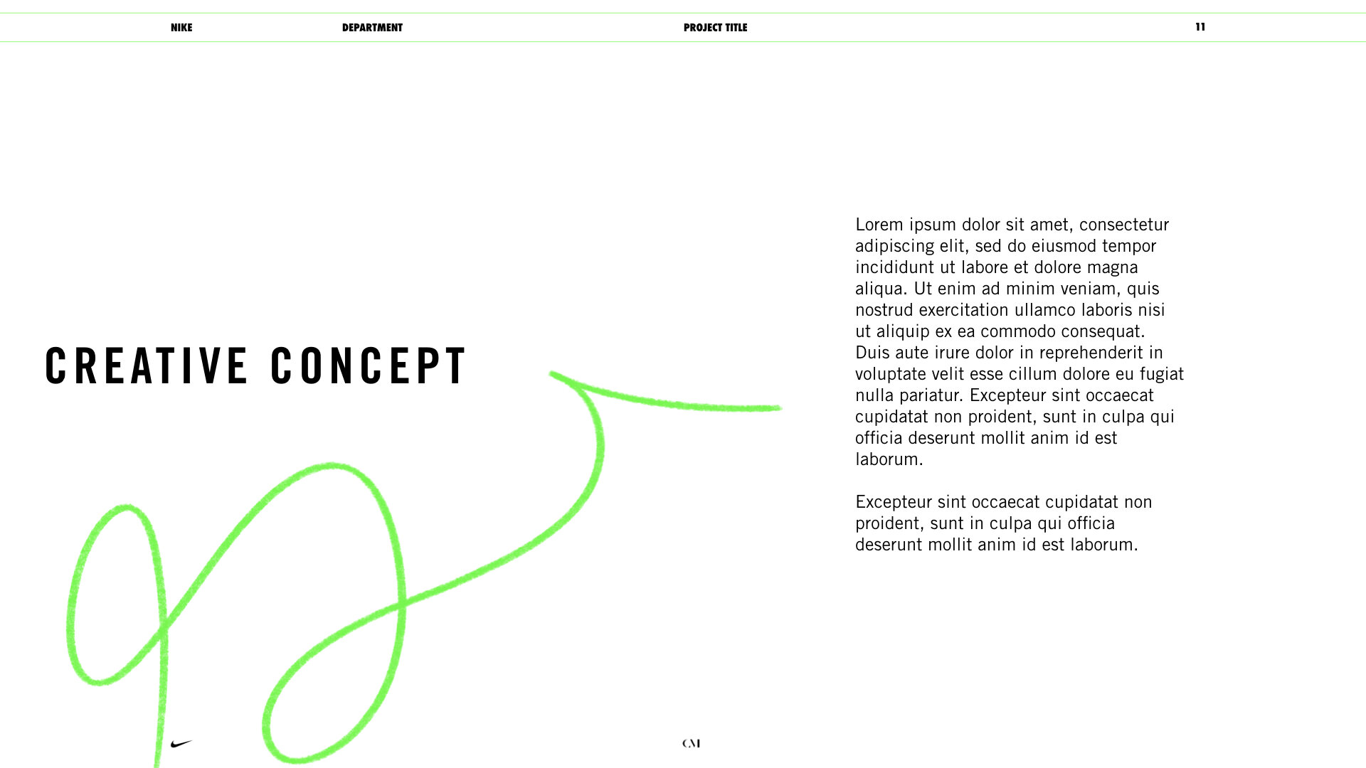
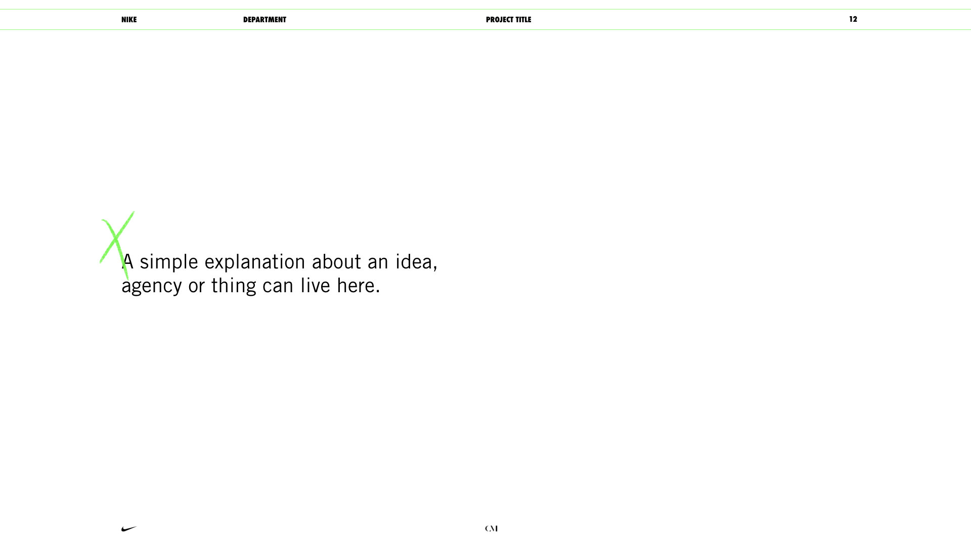
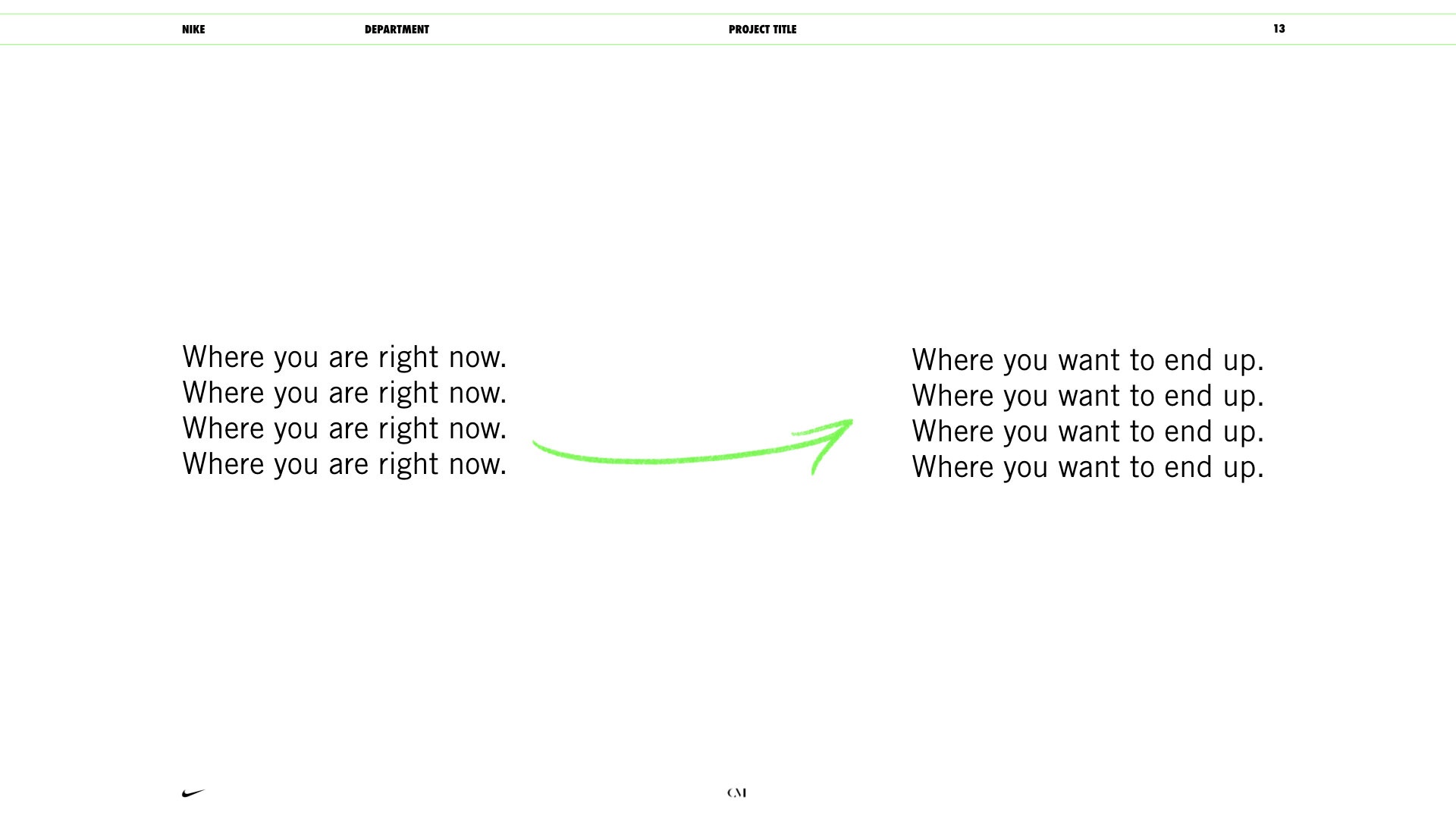
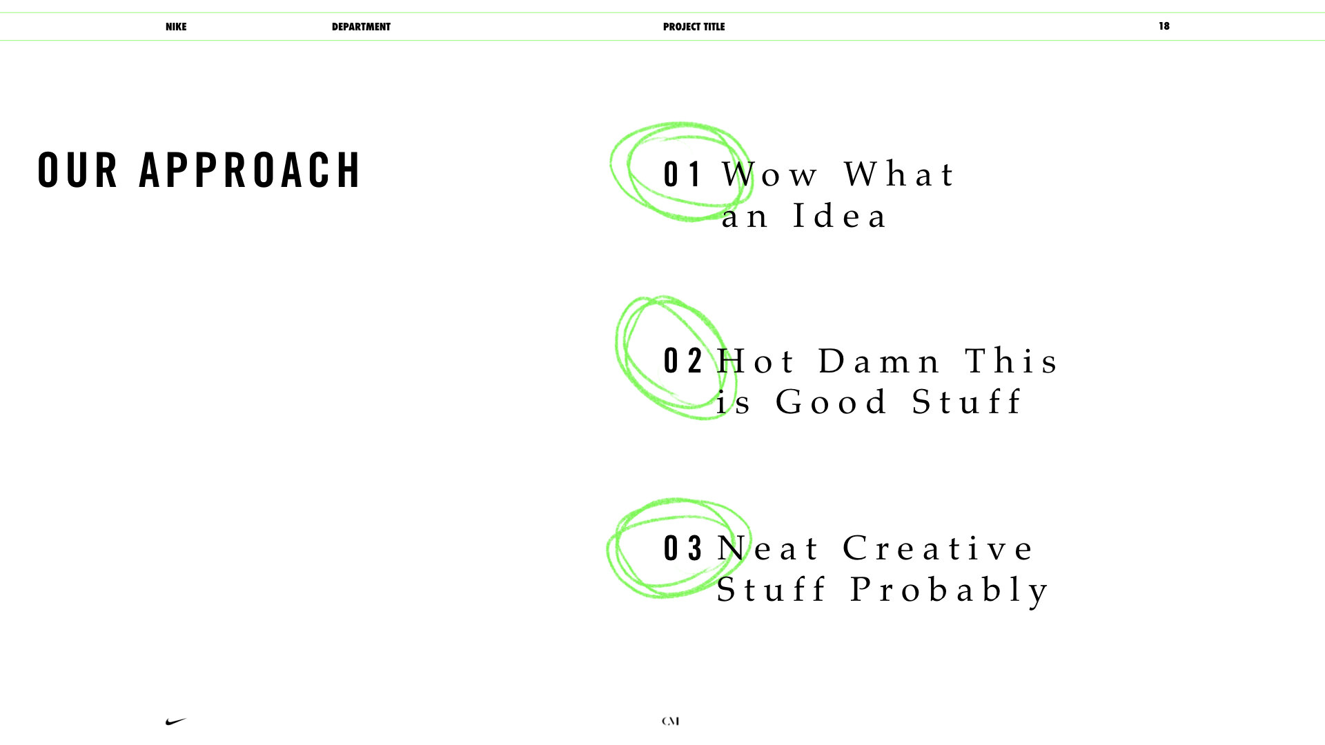
Conscious Minds really values “human-centered” storytelling and design, so I created a gallery of individual, hand-drawn doodles to be used as accents.


Now, bring it together.

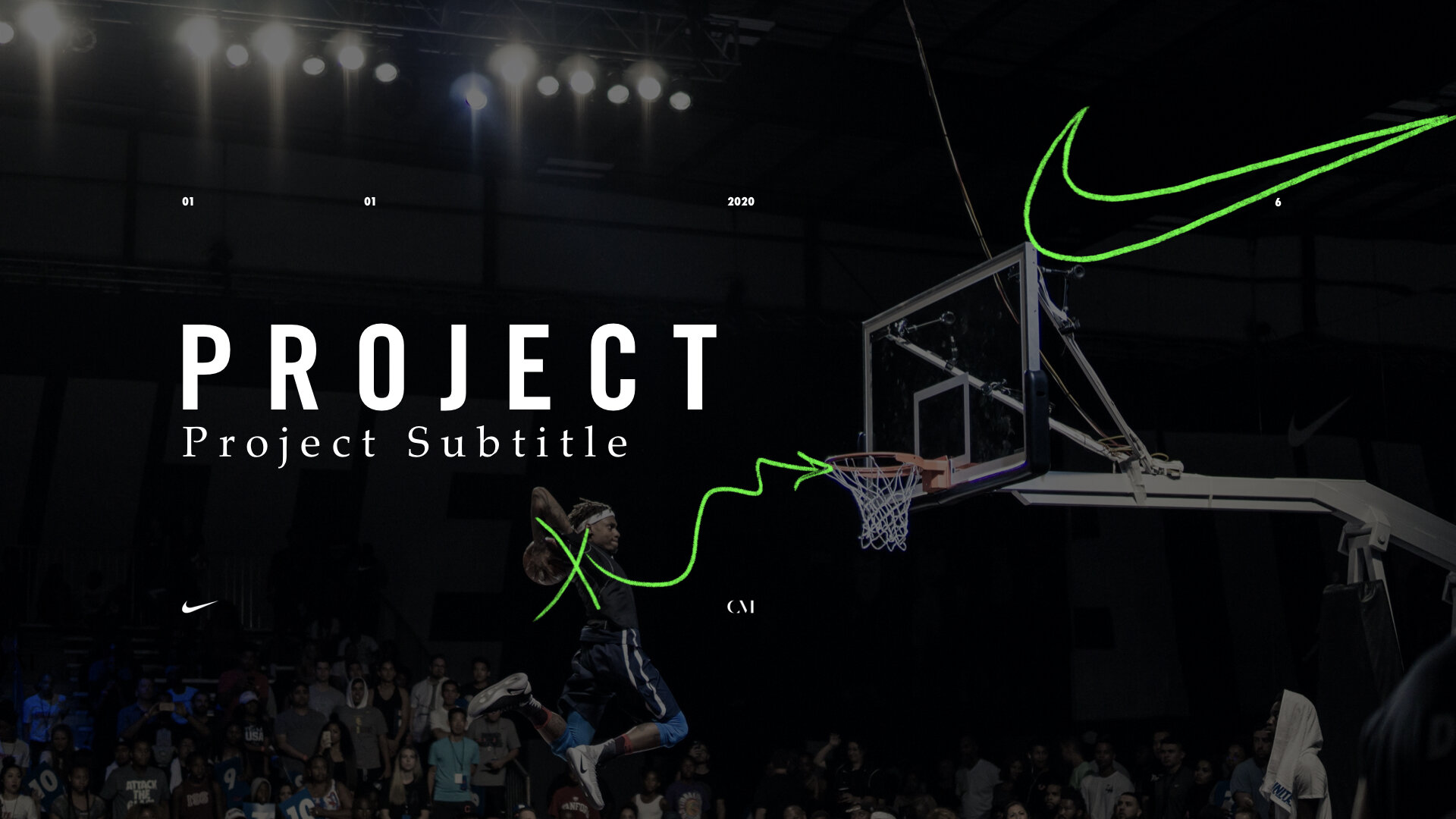
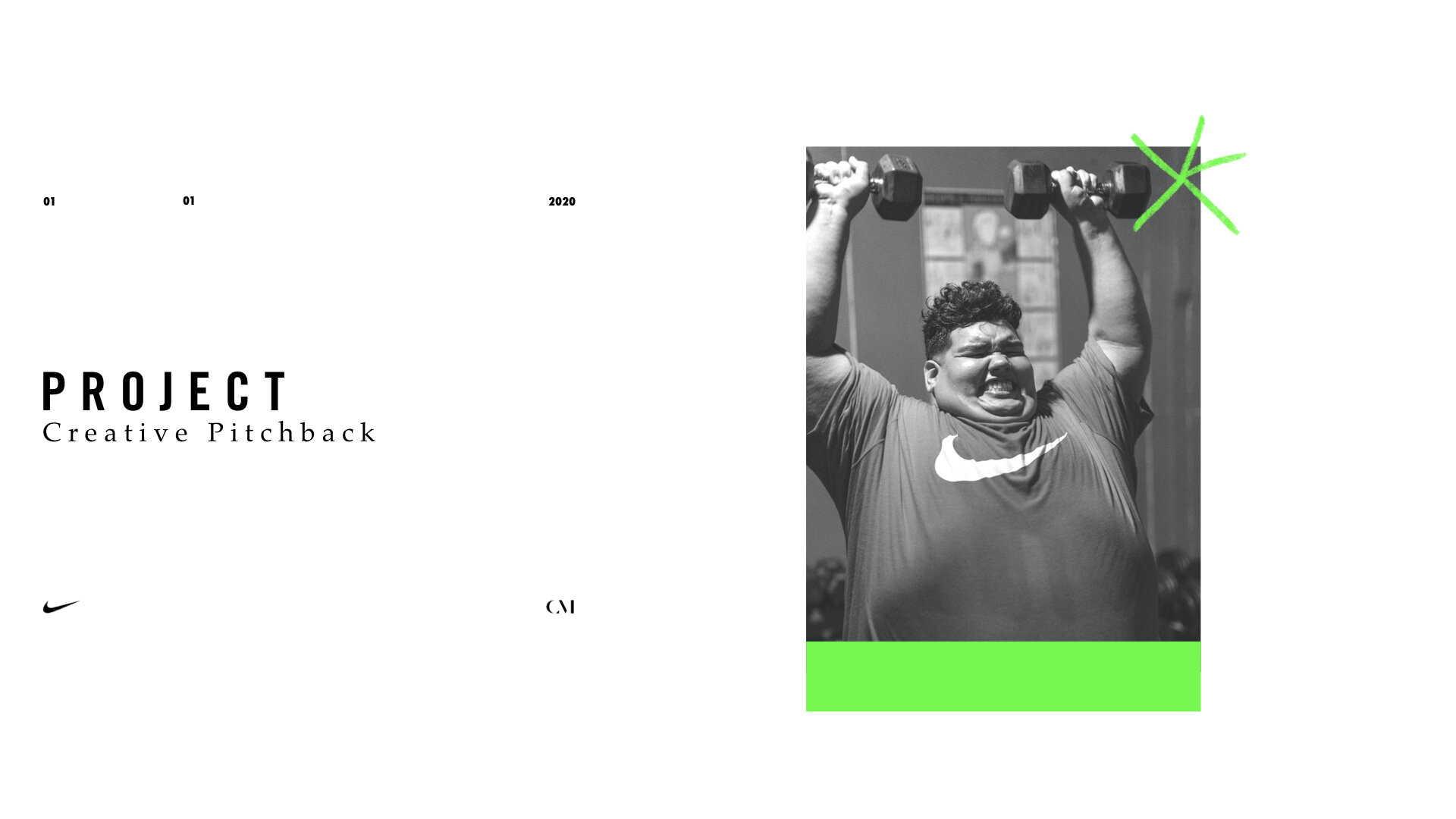
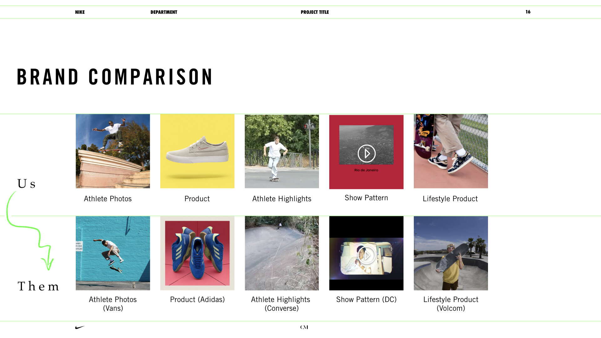
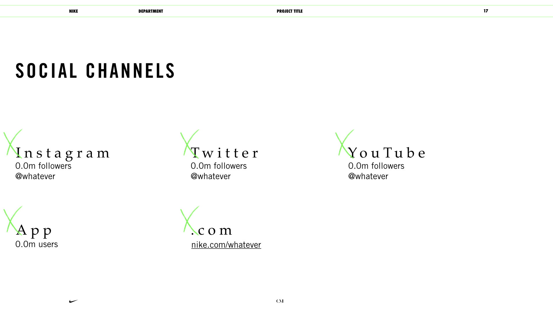
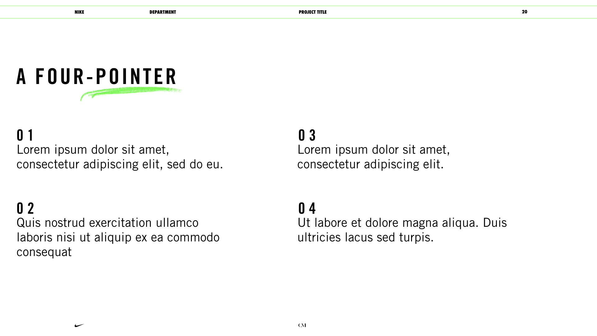
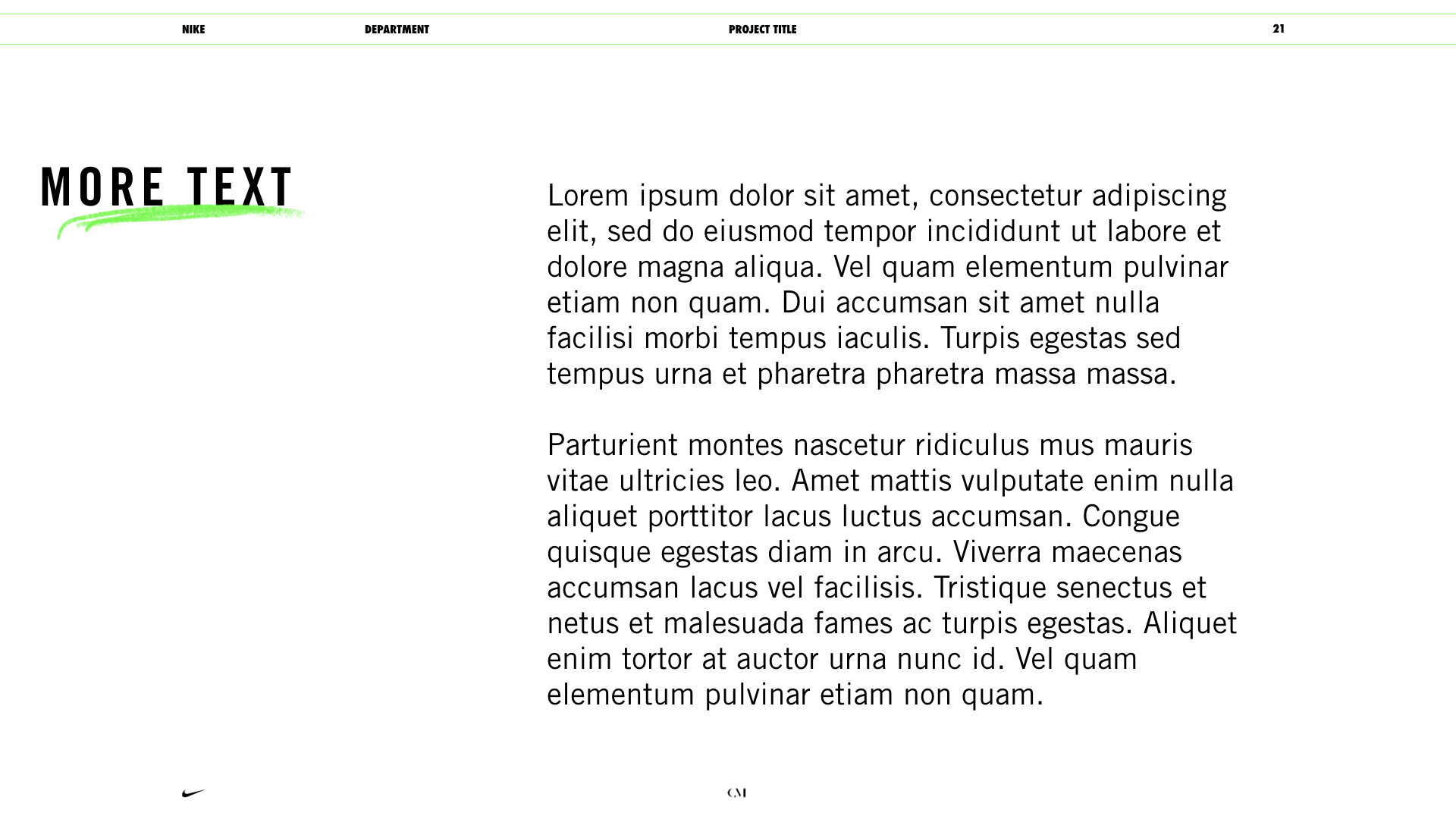
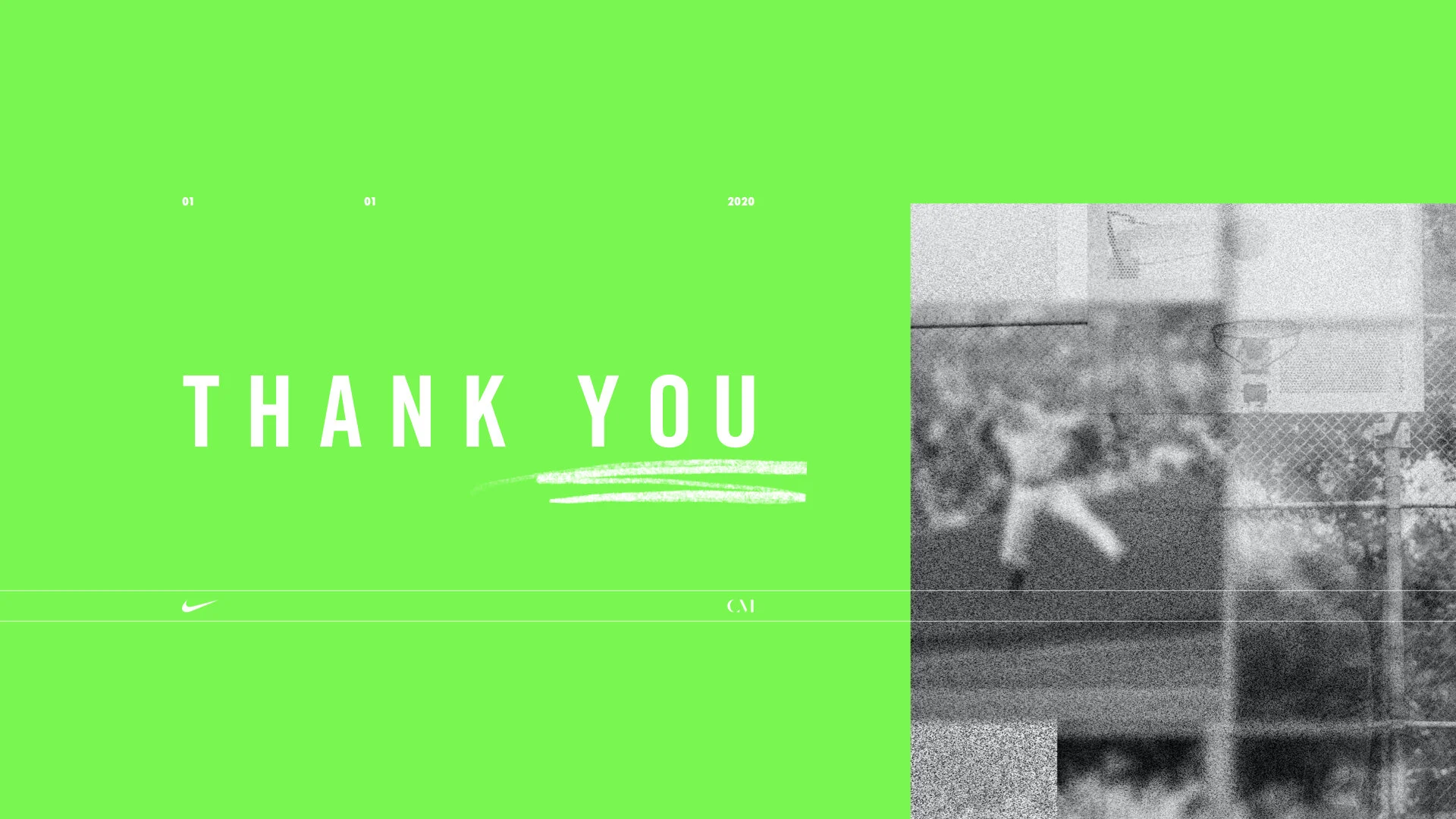
Using the grid, I built out dozens of unique slides so that non-designers would be able to use the system without having to build anything from scratch.
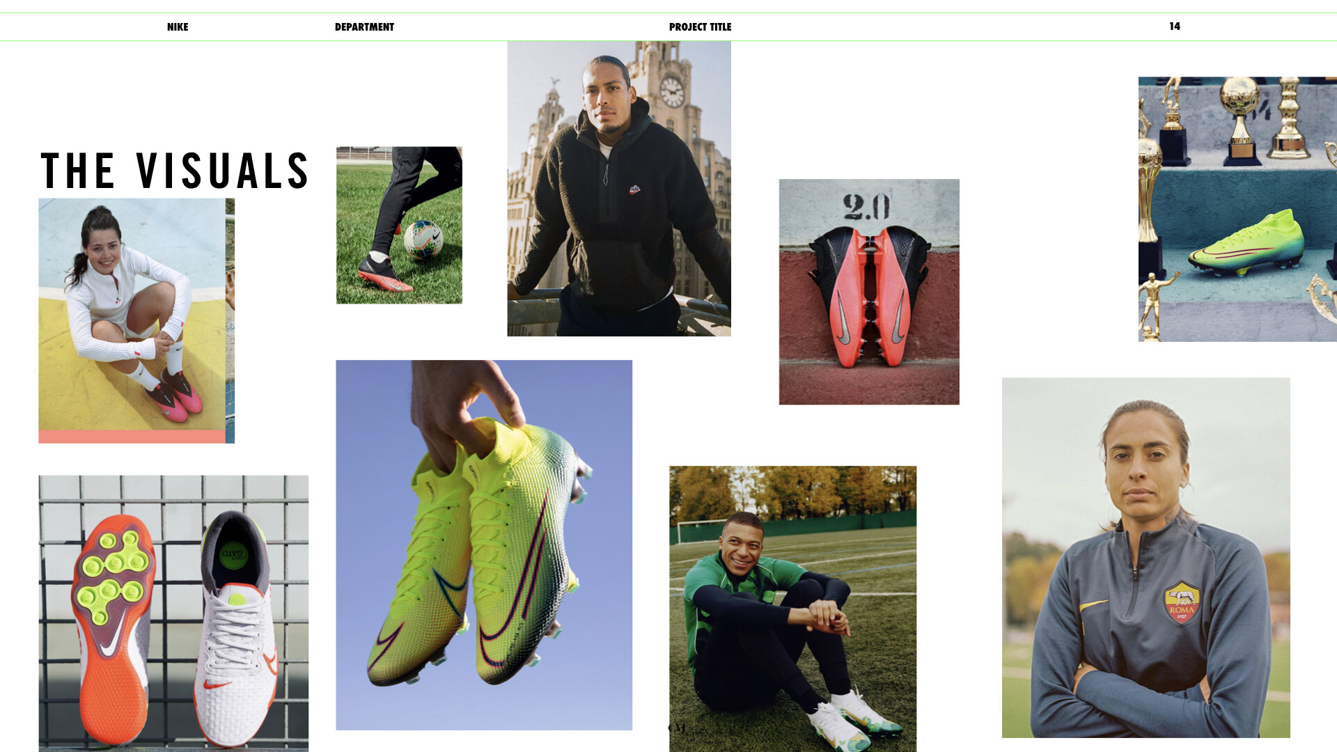
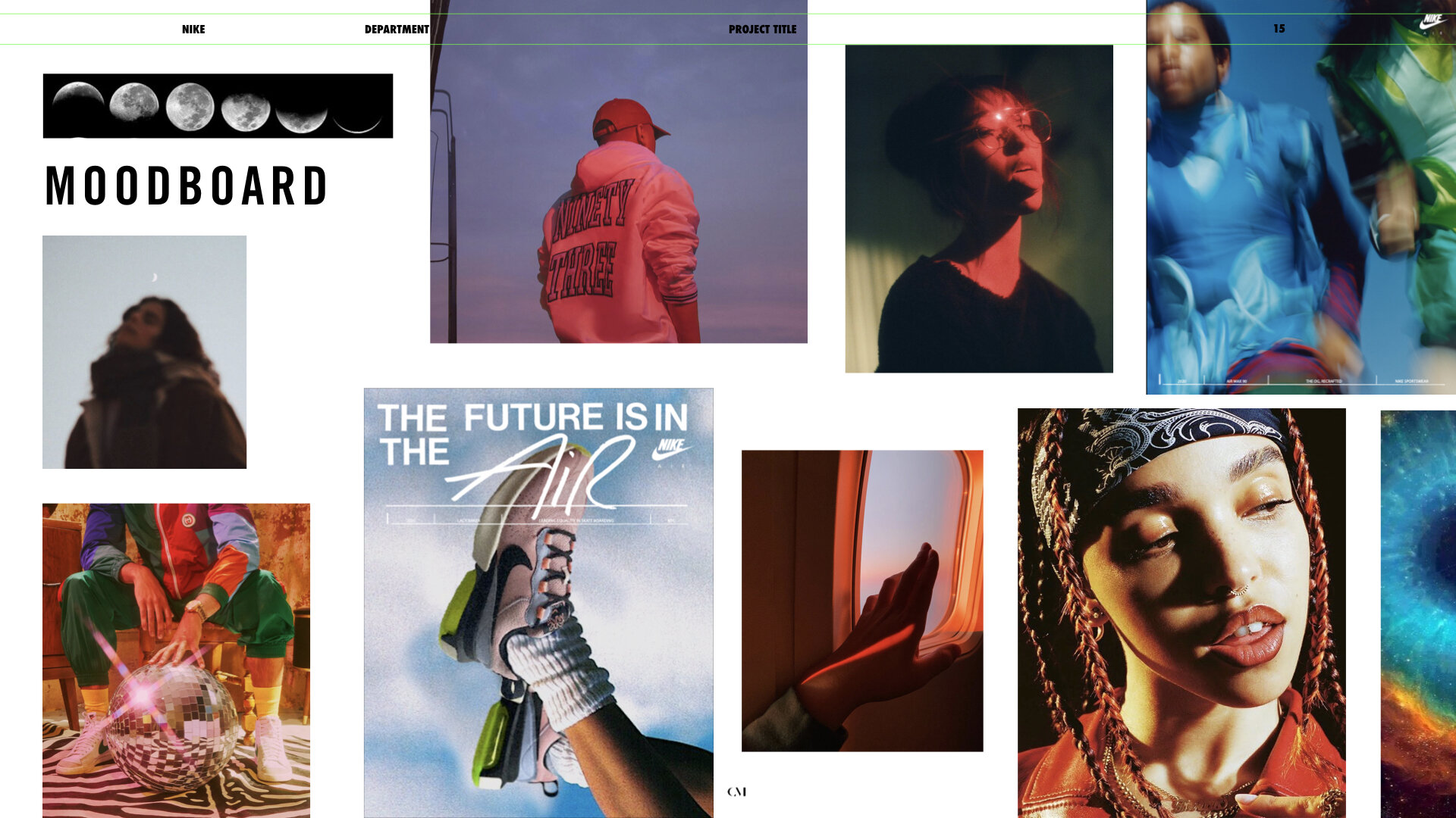
The goal: No matter who was using this visual system or what it was being used for, it would maintain a consistent feel. Here’s a selection:
The design can be easily adapted for specific projects or campaigns. If you want to keep it vanilla, it’ll look super clean. If you want to get a little wacky, go for it.